Colour is the decision people spend longest on and get the least useful help with, because almost everything written about it is a mood board. What decides whether you are happy in five years is duller: which sort of mess the surface shows, what your room does to it at four in the afternoon, and whether the pattern survives being cut into pieces. Worktop Worx fits colours across quartz, granite and Dekton, and the advice below holds for all three.
Key points
- Pale hides crumbs and shows pigment; dark hides pigment and shows water, dust and fingerprints; mid grey with speckle hides the most
- Finish changes behaviour as much as colour: matt hides more but is harder to clean properly, polished wipes faster but shows everything
- North-facing light kills a cool grey and flatters a warm white; judge every sample under your own lighting, morning and night
- Choose the worktop against the cabinets and the floor, and let the worktop be the element that commits least, because it will outlast both
- For anything strongly veined, or for a large island, see the full slab before it is cut: a 100mm chip cannot show pattern scale or repeat
01 / 09
The short answer
Mid greys and speckled patterns hide more than anything else, so choosing grey is a practical decision rather than a failure of nerve. Pale surfaces hide crumbs, dust and limescale and show pigment: tea, turmeric, red wine, tomato. Very dark surfaces do the reverse, hiding pigment and showing water spots, fingerprints, dust and wiping streaks. Nothing hides both.
So the useful question is not which colour is easiest to look after, but which kind of mess you would rather see. Answer that honestly and the shortlist halves before you handle a single sample.
02 / 09
The four families people actually choose between
Our colour library holds 185 surfaces across quartz, granite and sintered stone, filtered on six tone tags: white and cream, grey, black and dark, gold and warm, marble effect, and sparkle. Almost every kitchen comes down to four of them.
The material narrows it slightly. Grey runs right through quartz, granite and sintered stone, so it survives whatever you decide about heat and sealing. The widest choice of clean whites and of marble-effect veining is in quartz, and the densest blacks tend to be granite and sintered stone, where the colour is the material rather than a pigment in a resin. Warm golds and sparkle are smaller families and both are strongly affected by lighting.
| Colour family | Hides well | Shows readily | Suits |
|---|---|---|---|
| White and near-white | Crumbs, dust, limescale, dried water marks | Tea, turmeric, red wine, tomato, anything pigmented left to sit | Small rooms, north-facing rooms, anyone who wipes as they go |
| Mid grey and speckled | Nearly everything: dust, water, crumbs, wiping streaks | Very little, which is the whole case for it | Family kitchens, rentals, anywhere you would rather not think about it |
| Black and very dark | Coffee, wine, dark sauces and most pigment | Water spots, fingerprints, dust, streaks, limescale | Islands and feature runs, and households that dry surfaces |
| Marble effect and veined | Light marking, but only in the busy parts of the pattern | Marks in the plain field between veins, and a badly matched join | Islands where the pattern is meant to be noticed |
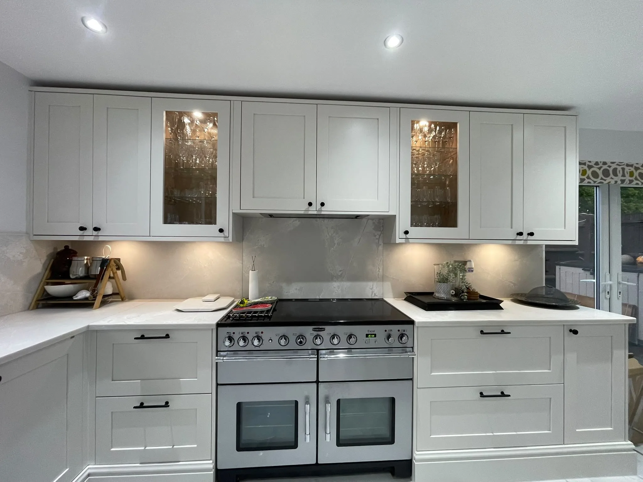
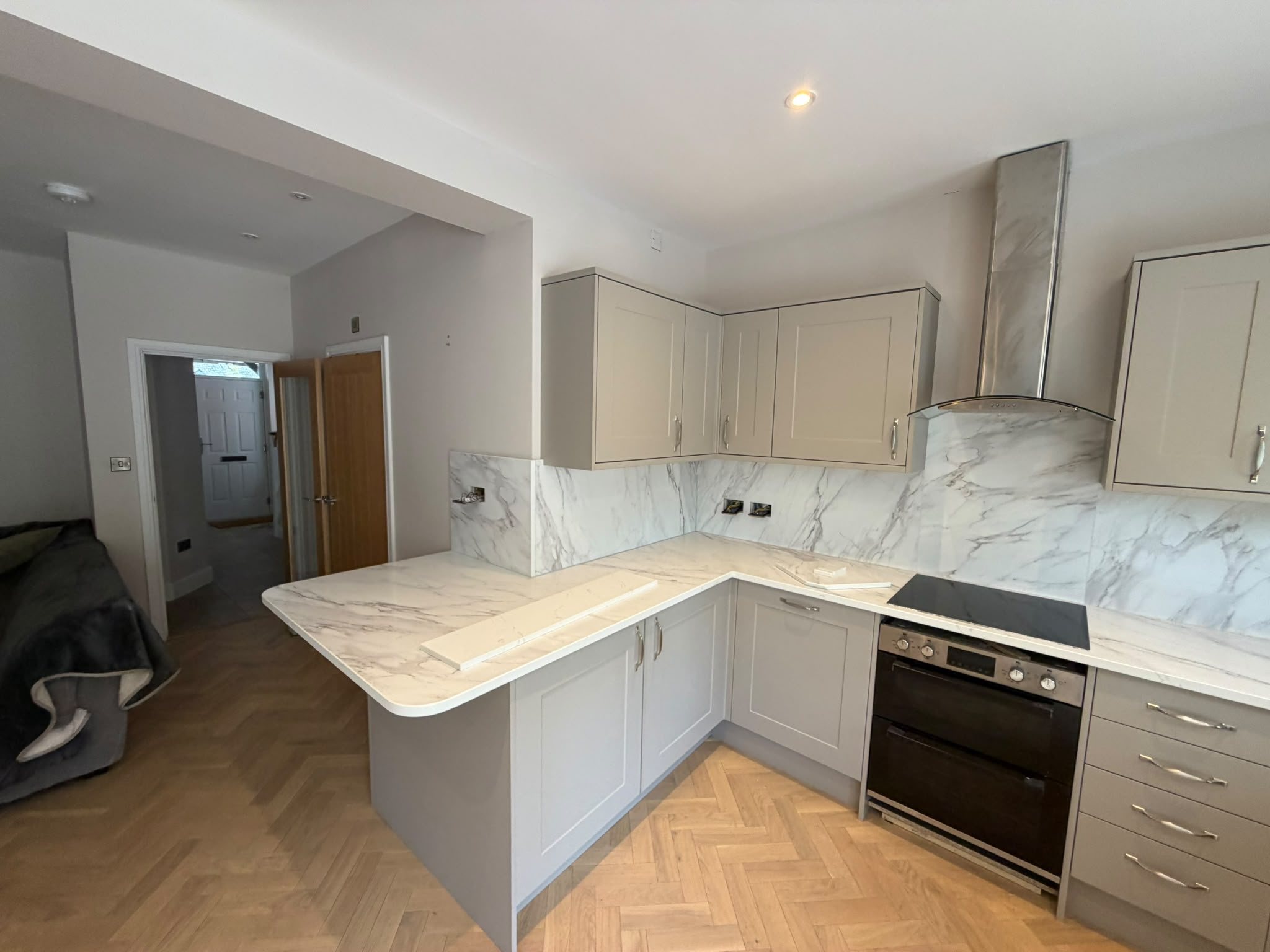
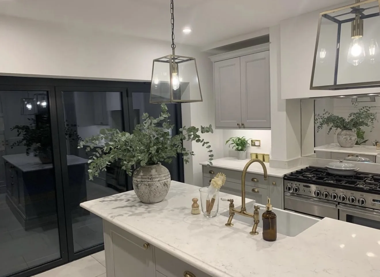
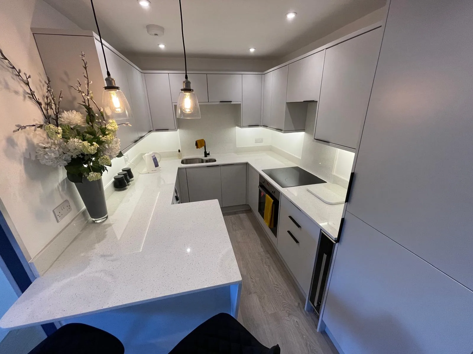
Examples from our range
03 / 09
How each one behaves once it is in
White and near-white push light around a room and make a small kitchen read larger, which is the main reason to choose one. What they show is pigment: turmeric worst, then strong tea, red wine and tomato. On a non-porous surface such as quartz or sintered stone none of it soaks in and all of it wipes off the same day, so most white-worktop horror stories are about a porous stone or a spill left for a week. The catalogue whites run from flat and cold, such as Pure White and Snow White, to softer veined ones like Bianco Carrara.
Mid grey is the most forgiving colour in a working kitchen and it is not close. Dust, crumbs, water spots and light marking all disappear into it, and it sits happily against almost any cabinet colour. Speckle beats plain: a flat mid grey still shows a wiping streak, where a granular one such as Grey Expo or Silver Dune in quartz, or a Dekton grey such as Kreta, swallows it. If low maintenance is the priority, choose a grey with movement in it.
Black and very dark surfaces are the most misrepresented of the four. They photograph beautifully and, in life, look immaculate for about an hour after you wipe them. Every water spot, fingerprint, dust mote and cloth streak shows on a polished black, and much of London is a hard-water area, so evaporating splashes leave pale spotting as well. None of it is damage and all of it wipes off, but you will be wiping. Granites such as Star Galaxy, and sintered blacks such as Kelya, Laurent and Sirius, reward anybody who dries them down and punish anybody who does not.
Marble effect rewards care more than the others. A good one has veins that vary in width, direction and depth, with soft secondary movement between them; a poor one is a photograph, a repeat that stops dead at the surface. Calacatta and Statuario styles in quartz cover most of the ground. In use, a veined surface hides marks where the pattern is busy and shows them in the plain field between veins, which is where you prepare food.
04 / 09
Finish does as much work as colour
The same colour in polished and in matt are two different worktops. Finish gets a fraction of the attention colour gets and changes the outcome more often.
A polished surface reflects, so it shows whatever interrupts the reflection: smears, water, fingerprints, dust. On a dark colour the effect doubles, because the reflection is what you are looking at, and the same colour in matt hides most of it. Polished also bounces light around a dark room, and a polished pale surface is far less punishing than a polished dark one because there is less contrast between the mark and the ground.
The trade is that matt is harder to actually clean. There is more texture for residue to key into, so it takes more wiping to be clean rather than to look clean, and on matt and textured sintered finishes a pan base can leave a grey metal smear that reads as a scratch and is not. Neither is better: matt hides more and works harder, polished shows more and wipes faster.
Rules of thumb on finish
- A dark colour where nobody dries surfaces: matt, or a lighter colour
- A small or north-facing room where you want the light back: polished, pale or mid
- Veining you want to read across the room: polished, which gives it depth
- Children and no patience for it: matt mid grey with speckle in it
Which finishes a given colour is made in varies by brand and batch, and is confirmed in writing at quote.
05 / 09
What the light in your room does to the colour
A north-facing kitchen gets cool, even, slightly blue light all day and no direct sun. That flatters warm whites and creams, and it kills a grey with a blue base, which goes flat and institutional. A south or west-facing room gets warm, variable light with real sun in it, which lifts a cool grey and can push a warm off-white towards yellow by late afternoon. The same slab in the two rooms is not the same colour.
Showroom lighting is not neutral either. Slabs are shown under bright, cool, overhead light on a polished face, the most flattering condition stone ever sees. Your kitchen has warm LED downlights and under-cabinet strips throwing light along the surface at a raking angle, and raking light is the cruellest test a polished worktop faces. It is why a surface that looked perfect in a showroom can look permanently smeared at home.
The remedy is unglamorous and it works, and on quartz it costs nothing. Order samples of your shortlist, leave them on the existing worktop for a few days, and look at them in the morning and again at night with the lights on, holding each against a cabinet door both times. Two or three together beats one at a time, because colour is easier to judge comparatively than in isolation.
06 / 09
The worktop, the units and the floor are one decision
The surface is only ever seen against the cabinet doors below it and the floor beyond it, and the workable rule is that two of the three should agree while one does the talking. A busy floor with plain cabinets and a plain worktop is calm. A quiet floor with plain cabinets and a strongly veined worktop is a feature kitchen. A busy floor, patterned cabinets and a veined worktop is a fight nobody wins, and it is the commonest way a good worktop ends up looking wrong.
The other half is time. Cabinet doors get repainted and floors get replaced; a stone worktop fitted properly outlasts both, so it should commit least. Matching one precisely to today’s cabinet colour makes it hostage to a decision you may reverse in five years.
07 / 09
Veining, pattern and what happens at a join
A strong directional vein is the one colour choice that changes the fabrication. Where two pieces meet the pattern either continues convincingly or restarts out of step, and that is decided at template stage on the slab, not on delivery day. The same applies on a mitred edge, where the pattern is carried from the top down the apron. A good mitre on a plain colour is invisible; a poor one on a veined colour shows as a break along the whole front edge.
That is not an argument against veining, only for choosing the veining and the join positions in the same conversation, and for asking to see a mitred sample rather than a photograph of one. A quieter pattern is more forgiving of a long run with several joins. Scale matters too: a vein that reads as elegant across a two-metre island can look frantic on a galley run where you only ever see 600mm of it at a time.
08 / 09
Four kitchens, four answers
Where each family earns its place
- Family kitchen, cooked in daily: mid grey with speckle or fine movement, in quartz. It hides the most, needs no sealing and does not care what the cabinets do next.
- Rental or a property you will sell: mid tone, low drama, plain. It photographs acceptably and is the least likely thing in the kitchen to put anyone off.
- Design-led island where the surface is the point: a strongly veined marble effect, or a deep black in sintered stone, polished, with veining and joins agreed on the slab. A black island gets wiped often, and that is the price of it.
- Small, dark, north-facing room: pale and polished, in a warm-leaning white rather than a cold one. It gives the light back and avoids the blue-based grey the light will not flatter.
These are starting points, not prescriptions. Any of the four works in any of these kitchens if you know what it asks of you. The unhappy outcomes are almost never the wrong colour; they are the right colour bought with the wrong expectation.
09 / 09
Which worktop colours date, and which do not?
Mid-tone, low-drama surfaces date least. High-contrast choices date most: a solid gloss black, a heavily speckled dark granite and a very strongly veined white all read as belonging to a decade in a way a plain mid grey does not. That is not an argument against them, only for knowing which you are buying.
A buyer notices a worktop that looks tired far more than one that looks unfashionable, and looking tired comes from scratches, dull patches, stains and bad joins rather than from colour. Choose the colour for how you want to live with it, and spend what attention is left on the fabrication.
Colour and price are only loosely related. Material runs from £110/m² supply to around £550/m² supply, the slab only, before fabrication, edge work, cut-outs, delivery or installation. There are cheap whites and expensive whites, and the same holds for every family here.