Green cabinets are now the second most popular choice in Britain, and almost every page written to answer this question treats green as a single colour with a single answer. It is not one colour. Sage is a grey-green and it is cool. Olive is a yellow-green and it is warm. Forest is a blue-green and it is deep. Put the same worktop against all three and you will get one kitchen that works, one that looks slightly grubby, and one that looks like two people specified it without speaking. The rule that separates them takes a paragraph, and nobody publishes it.
01 / 08
The rule, in one paragraph
The short answer
- Match the worktop’s undertone to the green’s undertone. Cool green wants a cool or genuinely neutral surface; warm green wants a warm off-white or a soft cream.
- Sage plus a stark, blue-white quartz is the pairing that goes wrong. It looks crisp on day one and reads dirty by year two, because the paint warms and the stone does not.
- Forest and other deep greens are the only family where high contrast is safe, and even then a black granite kills the room if the light is poor.
- The combination we are called back to most often across all three greens is a busy gold-veined slab. It fights the colour rather than sitting with it.
That is the entire method. What follows is why each part of it is true, and how to check your own pairing before a slab is cut rather than after.
02 / 08
Why this question exists now
Ten years ago the answer to "what worktop goes with my kitchen" was easier, because the kitchen was grey and grey has no strong undertone to argue with. The Houzz UK Kitchen Trends Study published in January 2026, which surveyed more than 400 UK homeowners about a recent or planned kitchen, puts green at 17 per cent of cabinet colour choices, second only to blue at 18 per cent, and comfortably ahead of grey at 12 per cent.
Cabinet colour choice among UK homeowners
Pinterest’s spring 2026 trend report also logs "sage green and cream kitchen" among its rising kitchen searches. Pinterest does not break those figures out by country in that report, so treat it as global search interest rather than a British number, the Houzz study is the one with a stated UK sample, and it is the one this page leans on.
The practical consequence is that a lot of people are now choosing a hard, permanent surface against a saturated painted colour for the first time, with advice written for a period when they did not have to. Specifying a worktop that still looks right in year five used to be mostly a question of picking a sensible grey. It is not any more.
03 / 08
Sage: cool, and the one that goes wrong
Sage is a grey-green. Its undertone is cool, and the instinctive move is to reach for the crispest white quartz on the board, because in a lit showroom sage plus brilliant white looks fresh and expensive. It is also the pairing most likely to look wrong first, and the reason is not aesthetic taste. It is that the two materials do not age at the same rate.
Painted and lacquered cabinet doors warm slightly over their first couple of years. Cooking does some of it, sunlight does some of it, and the binder in the finish does the rest. It is a small shift and you would never notice it on its own. Engineered quartz does not move at all, the pigment is locked in resin and the colour it leaves the factory is the colour it stays. So a pairing that started at zero visible difference slowly opens a gap, and because the stone is the fixed reference, the sage is the thing that starts reading yellow and tired. The customer describes it as the worktop looking dirty. It is not the worktop.
What happens to sage against a stark cool white
- Day onecrisp, high contrast
- Year oneno visible change
- Year twopaint reads warmer
- Year threewhite now reads cold
- The call"the worktop looks dirty"
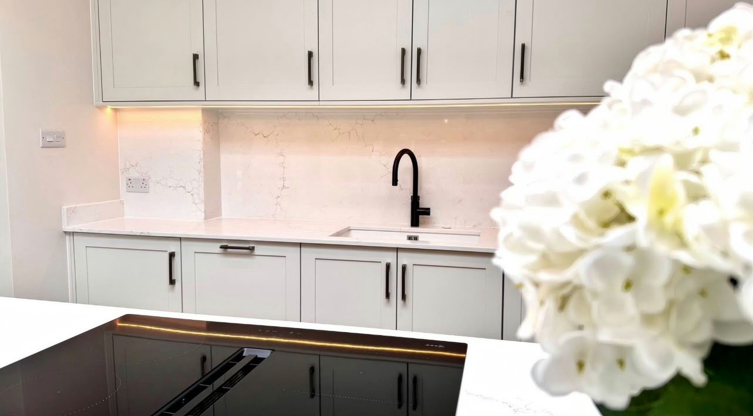
The fix is to build the drift into the specification. Choose a soft off-white or a very lightly warmed white rather than a blue-white, and the gap that opens over three years closes the difference instead of widening it. A fine, low-contrast marble-effect with grey veining is the safest single answer for sage: the grey in the vein reads as a relative of the grey in the green, and the field colour has somewhere to go as the doors warm.
- Works: soft off-white with fine grey veining; warm-neutral pale greys; light stones with visible movement rather than a flat field.
- Risky: brilliant blue-whites, unless the doors are a factory-sprayed finish you are confident will hold colour.
- Avoid: heavy gold or bronze veining, and anything with a warm beige field.
04 / 08
Olive: warm, and easier than it looks
Olive is a yellow-green, and once you have accepted that, the answer follows. It wants warmth around it. Cream, bone, oatmeal, a warm mid-grey with a brown bias. All of these sit with olive without effort, because they share its direction. This is also the family where a wood-look or a warm stone splashback earns its place, and where a very cold white is the obvious mistake rather than a subtle one.
The failure mode with olive is more specific than with sage, and it is greige. Greige quartz (the grey-beige family that has been the default "safe" choice for a decade) has an unpredictable bias. Under showroom lighting a lot of greiges read as a warm mushroom. Against a yellow-green door in domestic light, the same slab can swing violet. It is a real effect, it is not subtle when it happens, and the sample is small enough that you will not see it coming. Anything sold as greige should be tested against the actual door before it is ordered.
Olive is also the green most tolerant of a mid-tone worktop rather than a pale one. Because the cabinet colour is already carrying warmth, you do not need the worktop to supply any, which frees you to choose on practicality instead, and a mid-tone with speckle or fine movement hides more day-to-day mess than any other surface in the catalogue.
05 / 08
Forest and other deep greens: the only place contrast is safe
Forest, bottle and hunter greens are blue-greens: deep, cool and heavy. They behave more like a navy kitchen than like sage, and the same advice applies, a deep saturated colour needs the horizontal plane above it to give light back. A pale worktop against dark green cabinets is not a compromise, it is the point. It is the same principle that makes a dark island under a rooflight work and a dark run against a wall feel sullen.
Where people go wrong with forest is the opposite of sage. They reach for black granite or a very dark sintered stone because the tonal logic seems right, and in a bright room with two aspects it can be. In one-window kitchen, and particularly in a north-facing kitchen, dark cabinets plus a dark worktop removes the last reflective surface in the room and the whole thing closes in. That is a lighting decision dressed up as a colour decision.
| Green family | Undertone | What the worktop should do | Most common mistake |
|---|---|---|---|
| Sage and other grey-greens | Cool, low saturation | Sit close in tone, share the grey, avoid stark contrast | A brilliant blue-white that goes on looking colder every year |
| Olive and other yellow-greens | Warm | Supply warmth or stay out of the way; mid-tones are fair game | Greige that swings violet, and cold whites |
| Forest, bottle and hunter | Cool, high saturation, deep | Bounce light back into the room | Dark on dark in a room with one window |
06 / 08
The combination we replace most
Across all three greens, one pairing comes back more than any other: green cabinets and a busy, high-contrast, gold-veined white slab. It is easy to see how it happens. Gold veining photographs beautifully, it looks expensive under showroom lighting, and green and gold is a genuinely handsome combination in a magazine photograph taken with the room lit from three sides.
In a real kitchen it does two things. The gold reads as yellow-brown under warm domestic lighting, particularly under 2700K downlights in the evening, so the pairing you approved in daylight is not the pairing you live with after six o’clock in November. And a large-scale, high-contrast vein is a strong statement competing with a strong cabinet colour. Two statements in one small room is not twice as good; it is noise, and noise is what people get tired of.
07 / 08
How to test it in half an hour
None of the above needs to be taken on trust, because the test is free and it takes about half an hour spread over a day. It matters that it is spread over a day; a single look under a single light source is what got the failed pairings approved in the first place.
Get the sample into the room
Quartz samples can be posted, which covers most of what people shortlist for a green kitchen. Granite and sintered stone offcuts generally cannot be sent (they are too heavy and too brittle for a courier), so for those you are looking at a slab rather than a chip, and you should plan for that rather than choosing off a screen.
Tape it to the door, at worktop height
Not held in your hand, not on the floor. At the height it will actually sit, touching the cabinet, so you are judging the join rather than two objects near each other.
Look at it three times
Mid-morning, four in the afternoon, and after dark with your own lights on. A pairing that holds in all three will hold. A pairing that goes off in one of them will go off in that one every single day.
Photograph it, then look at the photograph
A camera is unsentimental about undertone in a way the eye is not, because your eye compensates for the colour of the light and the sensor does not. If the white looks blue in the photograph, it is blue.
Ask what happens at the join
If the run is longer than a slab there will be a join, and on a veined stone the position of that join is a design decision, not a manufacturing detail. Ask where it will fall before you commit to a pattern.
08 / 08
Questions people actually ask
01Can I put a grey worktop with sage green units?
Yes, and it is one of the more reliable answers, provided the grey is a warm or neutral grey rather than a blue-grey. Sage and a cool blue-grey read as two versions of the same idea disagreeing slightly. Sage and a warm mid-grey read as deliberate, and the grey hides more mess than a white will.
02Is white quartz wrong with green cabinets?
Not wrong, the wrong white is wrong. Whites run from blue-white through neutral to distinctly creamy, and the gap between the ends of that range is far bigger than most people expect. With sage, choose from the warmer half. With olive, warmer still. With forest, you can use almost any of them, because the contrast is doing the work rather than the undertone.
03Does the finish change the colour?
It changes how you read it. The same slab in matt looks a shade deeper and considerably flatter than the polished version, because polishing returns light directly to your eye and matt scatters it. Against a dark green that difference matters, since the pale worktop is there to bounce light. Whether the surface should be matt or polished is a separate decision with its own trade-offs, and it should be taken after the colour, not before.
04What about a wood worktop with green units?
It is a very good combination and we do not fit it, so take that as a straight answer rather than a pitch. Solid timber against olive or sage is warm and forgiving, and it is significantly cheaper than stone. What it costs you is maintenance. It wants oiling, it marks around the sink, and it will not tolerate a hot pan. Plenty of people take that trade knowingly and are happy. A common compromise is stone on the run with the sink and hob, and timber on an island or breakfast bar where nothing wet lives.
05My cabinets are not painted yet. Does that change anything?
It changes everything, and in your favour. Choose the stone first and get the paint matched to it. A repaint is a weekend and a few tins; a worktop is a template, a fabrication slot and a fitting day. Almost nobody has the freedom to do it in that order, and if you do, use it.
What to take away
- Green is three colours, not one. Sage is cool grey-green, olive is warm yellow-green, forest is deep blue-green, and they want different surfaces.
- Match undertone to undertone. The pairing that fails is sage against a brilliant blue-white, because the paint warms over two or three years and the quartz does not move at all.
- Deep greens are the only family where strong contrast is safe, and even there a dark worktop in a single-aspect room takes the last reflective surface out of the kitchen.
- A busy gold-veined slab is the combination we are called back to most across all three greens. It reads yellow-brown under warm evening lighting and competes with the cabinets in daylight.
- Test the sample taped to the door at worktop height, at three times of day including after dark, and photograph it. The camera is more honest about undertone than your eye.
Sources
Every figure quoted above is traceable to one of these. Where a source is a price survey rather than our own quoting, it is named as such in the text.
- [1]2026 UK Houzz Kitchen Trends Study, Houzz UK, retrieved 25 August 2026
- [2]5 Worktops That Look Beautiful with a Green Kitchen, Houzz UK, retrieved 25 August 2026
- [3]Spring Trend Report 2026, Pinterest Newsroom, retrieved 25 August 2026
- [4]Green kitchen ideas, Ideal Home, retrieved 25 August 2026
- [5]How to style a sage green kitchen, Caesarstone UK, retrieved 25 August 2026